EaseUS Data Recovery Software Review
Every once in a while, I get this question from my friends and relatives. Their hard drive suddenly fails and they want to recover whatever data they can from the drive. Sometimes, they accidentally erase important files and they want to recover the lost files. Recently, I came across EaseUS Data Recovery software and gave it a try. Here is my review of EaseUS Data Recovery Software for Windows.
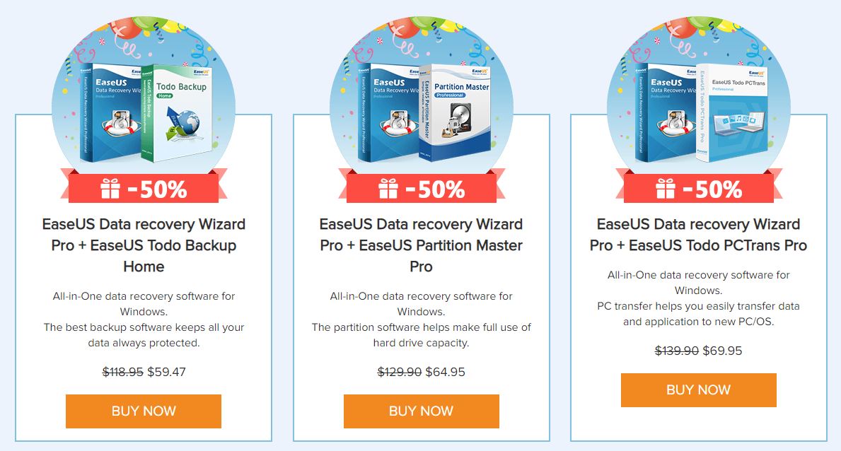
Right now, this software is available at discounted price, you can go to this offer page to avail this offer. If you are in IT, you can buy $299 technician user license and you can use it on unlimited computers in your company. You can purchase the software from EaseUS Store. For more details, you can visit EaseUS Home. You can also get free version if you have to restore less than 2GB of files.
EaseUS has 14 years of experience in making data back and recovery software for PCs and for Macs. EaseUS has various tools for data management like data recovery, data backup, Backup software, data transfer utilities etc.
Free and Pro
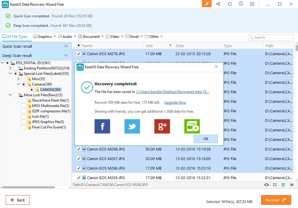
With Free version, by default, you can restore up to 500MB of files. When you share the application on facebook or twitter, you get additional 1.5GB quota. At the max, you get 2GB of recoverable files. This is not per each run. Once total files that you recovered hit 2GB, you cannot use the application to recover any data. You have to then upgrade to Pro version.
There are three variants of pro version. The basic pro version comes with single user license and can be used on one computer. Pro+WinPE bundle comes with single user license and ability to generage bootable recovery drive that can be used to boot into PC/laptop whose hard drive failed. Pro
Right now, EaseUS EaseUS Data Recovery Wizard Pro with Bootable Media is priced at $99.95. In most instances, there wont be a need for such recovery drive as there are ways to create bootable media.
The third variant is for business users. By paying little extra, you get license to install the software on unlimited computers in your organization.
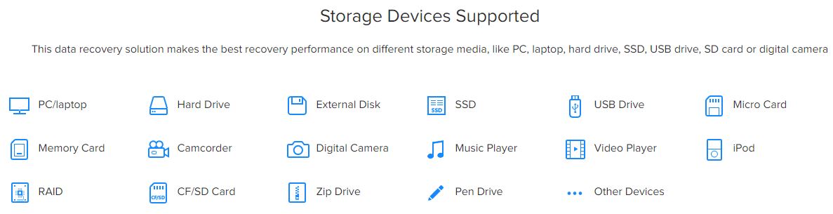
Supported Type of Devices and Files
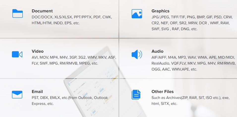
EaseUS data recovery software supports over 200 types of files (documents, images, graphics, video, audio, email, archives, exe to name few categories). This data recovery solution can be used to cover files from different storage media, like PC, laptop, hard drive, SSD, USB drive, SD card or digital camera.
Data Loss Scenarios supported by EaseUS
- Deleting files by right-clicking menu or just pressing ‘Delete’ button.
- File loss due to ‘Shift+Del’ without backup.
- File loss due to emptying Recycle Bin.
- Unexpectedly formatting disk, partition or other storage devices.
- Data loss due to hard drive crash, system crash or Windows reinstallation.
- Raw partition, disk displays as RAW or ‘Media/Drive is not formatted, would you like to format now?’.
- Sudden power-off, software crash, turning off storage media during writing process, improperly pulling out SD card.
- Other cases like device initialization, virus attack, Memory/SD card ‘Access Denied’ or can’t be read, media card error, factory setting of device without backup etc.
- Accidentally deleting a partition.
- Partition loss due to repartition, boot manager, improper clone, system restore, disk accident etc.
- Partition accidentally lost or be hidden.
- Disk crash, severe virus infection for hard drive etc.
User Interface and Ease of Use
This is what I liked most about EaseUS Data Recovery Wizard. Once you install and open the application, you see list of devices and drives from which you can recover data. You also get option to specific specific folder to scan.
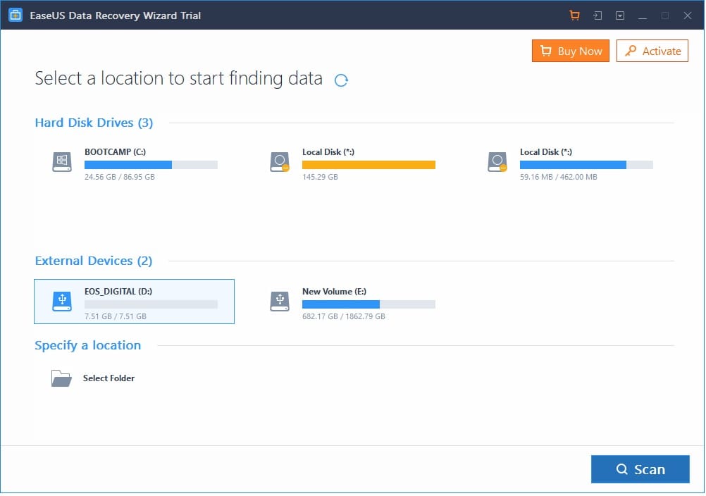
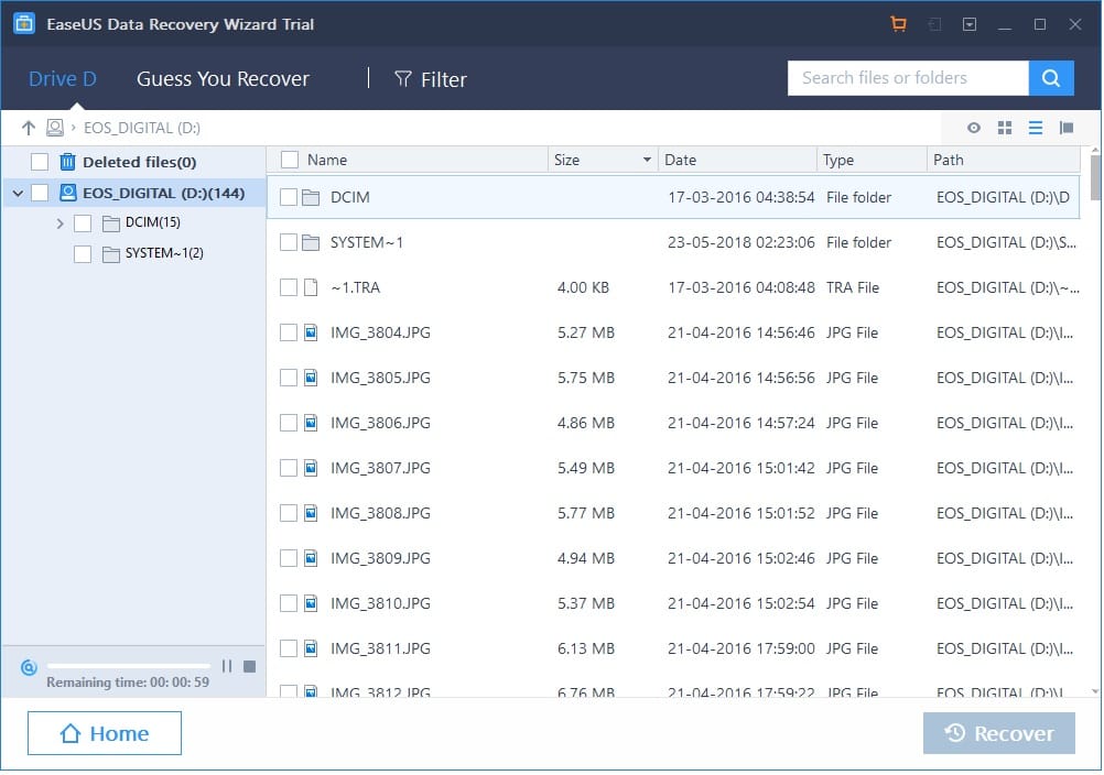
Select the drive that you want to scan and you will see wizard going through the drive and makes a list of files/directories that it parsed. At the top, you will see various tabs. Guess You Recover is where you see the list of files and directories that you can recover. Filter is to filter what type of files you need to recover. There is a search field if you are looking for a specific file or directory. In the left pane, you will see remaining time and list of directories that the scanner found.
There is one issue with the timer. It starts at 1 minute, counts down to 0 secs and again goes to one minute.
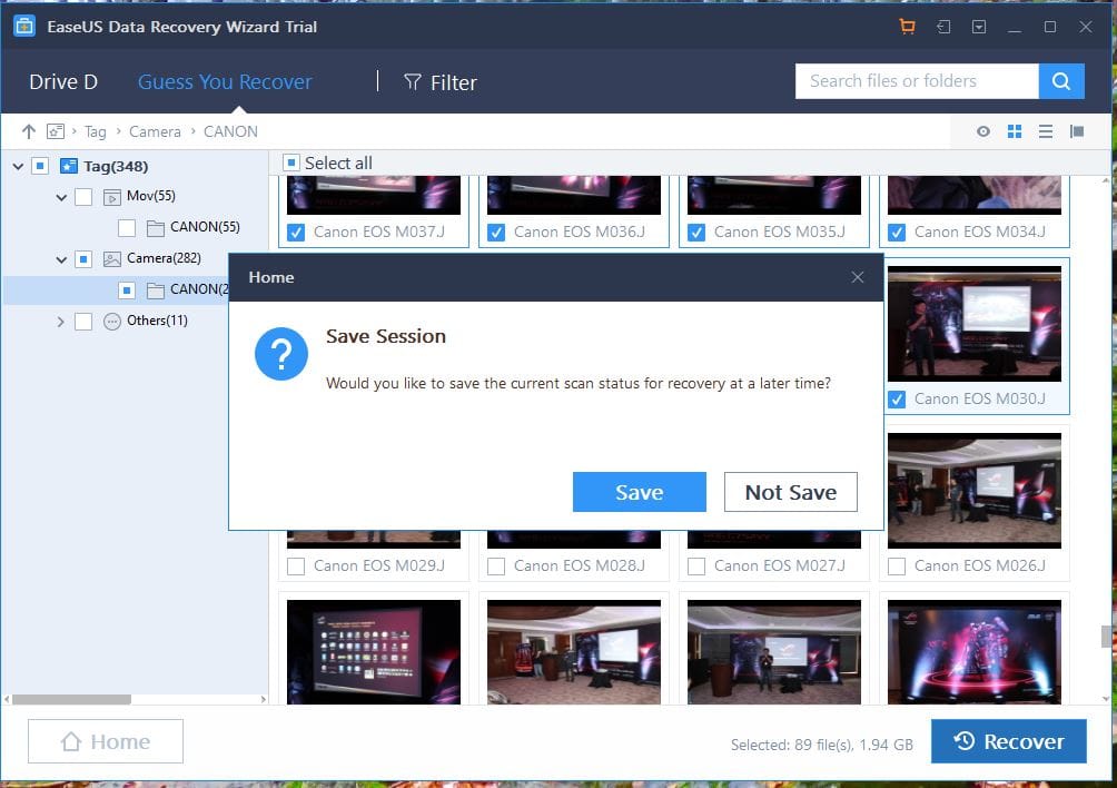
One great feature of this app is that you can save your session in a file and then open the file later when you are back. This can be very helpful when you go through a drive that is hundreds of Gigabytes in size and you do not want to scan again every time you shutdown the computer of close the application.
Performance
For a SD card that is 8GB in size, the scanner took just under 3 minutes to scan and gave me list of 282 photos and 55 videos that can be recovered. When I opened the folder to view, the application gave me thumbnail images of images and videos that can be recovered. The restore operation too was very quick. There were some photos that were removed long back and I used the camera couple of times after that. Do not expect the software to recover files after doing a full format. We did a full format by writing 0s to the storage SD card and when we did a scan, EaseUS could not find any files to recover. A quick format only removes the index table so it is easier to recover when such format is done on drive.
The application did really when when a volume was accidentally removed using windows partition manager. EaseUS was able to identify massive amount of files, some were removed long back. If you want to create an EaseUS recovery drive, you need to pay extra.
EaseUS has detailed guides on how to use the software. You can head to this page for full guide.
Conclusion
The EaseUS Data Recovery software is one of the best when it comes to ease of use and speed. For those who only have to recover small amount of data, free version will do. We are yet to peform 1:1 comparison with tools like Stellar Recovery and we will update you when we do such comparison. The strength of EaseUS lies in its simplicity and speed at which it recovers data. You may not get all features in one package. For that, you can keep an eye on discounts offered on weekly basis by EaseUS.