Popular VoIP app Skype has been updated to v6.0, bringing with it a fresh new design. Microsoft has been doing some brilliant work with its apps of late, and it’s only fair that Skype gets updated in the process too.

Microsoft has continued to distinguish between the two platforms – iOS and Android, respecting the design principles of both the platforms. This is slightly unexpected, especially from a big developer such as Microsoft. Most big developers go for a unified design, respecting one design language while ignoring the other. In this case, Microsoft gets full marks for doing what’s best for each platform individually.
In case of the iPhone and iPad apps, the new Skype 6.0 app gets a reworked UI that makes use of swipes and gestures better than before. Sharing of photos, videos, emojis and location has been made simple as well, so you should actually enjoy using the app now. Better yet, the iPad version has finally reached feature parity with its iPhone counterpart.
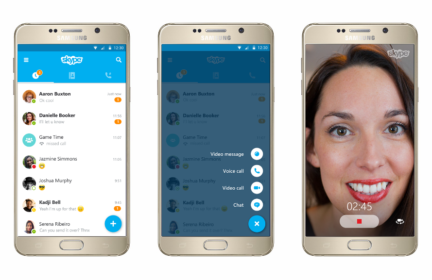
The Android version is a lot more exciting though – Microsoft has embraced Material Design guidelines fully. Even though the Skype app looked really good before, it finally feels like an Android app now. The design consistency is a welcome move, and as more and more users start updating to Lollipop, Material Design will become the norm. Apart from the new design, the Android version gets improved media sharing, a Floating Action Button and a better way to identify read and unread messages.
Grab the iOS and Android version of Skype below.
[appbox appstore id304878510] [appbox appstore id442012681] [appbox googleplay com.skype.raider]